web222
WEB222 - Week 9
Suggested Readings
CSS Continued
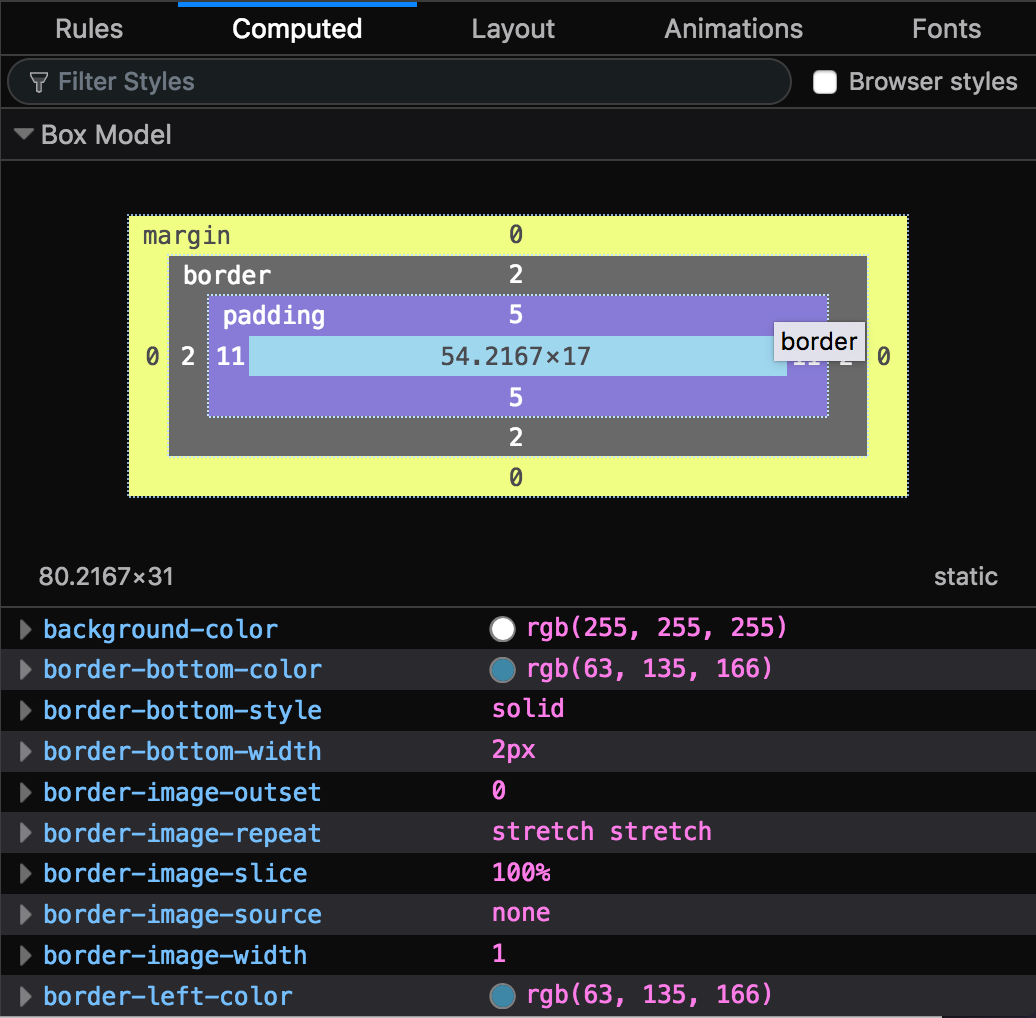
Box Model
All elements in the DOM can be considered to be a box. The Box Model is a specification for how all the various attributes of an element’s sizing relate to each other. A “box” is made up of four distinct parts:
- margin - area (whitespace) between this element and other surrounding elements
- border - a line (or lines) surrounding this element
- padding - area (whitespace) between the border and the inner content of the element
- content - the actual content of the element (e.g., text)
The easiest way to visual this is using your browser’s dev tools, which have tools for viewing and altering each of these parts.
The sizes of each of these can be controlled through CSS properties:
Each of these is a shorthand property that lets you specify multiple CSS properties at the same time. For example, the following are equivalent:
/* Use separate properties for all aspects */
.example1 {
    border-width: 1px;
    border-style: solid;
    border-color: #000;

    margin-top: 5px;
    margin-right: 10px;
    margin-bottom: 15px;
    margin-left: 20px;
}

/* Use shorthand properties to do everything at once */
.example2 {
    border: 1px solid #000;
    margin: 5px 10px 15px 20px;
}
In the code above for margin, notice how the the different portions of the
margin get translated into a single line. The order we use follows the same
order as a clockface, the numbers begin at the top and go clockwise around:
.example2 {
    /*      top right bottom left */
    margin: 5px 10px  15px   20px;
}
We often shorten our lists when multiple properties share the same values:
.example3 {
    /* Everything is different, specify them all */
    margin: 10px 5px 15px 20px;
}

.example4 {
    /* Top and bottom are both 10px, right and left are both 5px */
    margin: 10px 5px;
}

.example5 {
    /* Top, bottom, left, and right are all 5px */
    margin: 5px;
}
When two elements that specify a margin at the top and bottom are stacked, the
browser will collapse (i.e., combine) the two into a single margin, whose size is
the largest of the two. Consider the following CSS:
<style>
    h1 {
        margin-bottom: 25px;
    }

    p {
        margin-top: 20px;
    }
</style>
<h1>Heading</h1>
<p>Paragraph</p>
Here the stylesheet calls for a <p> element to have 20px of whitespace above it.
However, since the <h1> has 25px of whitespace below it, when the two are placed
in the DOM one after the other, the distance between them will be 25px vs. 45px
(i.e., the browser won’t apply both margins, but just make sure that both margins are
honoured).
display Property
CSS lets us control how an element gets displayed in the DOM. This is a large topic, and we’ll give an overview of some of the most common display types. Further study is required to fully appreciate the subtleties of each layout method.
Up to this point we’ve been talking a lot about the DOM, a tree of nodes for every element in our document. At this stage it’s also useful to understand that in addition to the DOM tree, a browser also creates a render tree, which is a tree of nodes as they will should be rendered based on CSS. A node may exist in the DOM tree but not in the render tree, for example. The nodes in the DOM tree can also have very different rendering applied based on the type of display we specify.
Perhaps the easiest way to get started understanding display types is to look at
what display: none; does:
<style>
    .hidden {
        display: none
    }

    .error-msg {
        /* styles for error message UI */
    }
</style>
<div class="hidden error-msg">
    <h1>Error!</h1>
    <p>There was an error completing your request.</p>
</div>
When an element uses a display type of none, nothing will be painted to the screen.
This includes the element itself, but also any of its children. This allows us
to create UI or aspects of a page but not display them…yet. For example, we might
want to reveal a dialog box, information message, image, or the like only in response
to the user performing some action (e.g., clicking a button). Or, we might want
to remove something like a loading screen when the web page is fully loaded:
<style>
    /* Place a semi-transparent box over the entire screen at startup */
    #loading {
        position: fixed; /* position this element by specifying top, left, etc */
        padding: 0;
        margin: 0;
        top: 0;
        left: 0;
        width: 100%;
        height: 100%;
        background: rgba(255, 255, 255, 0.5); /* make it a bit see through */
        z-index: 500; /* put this on top of other content */
    }
</style>
<div id="loading">
    <p>Loading...</p>
</div>
<main>
    <!-- rest of page content here -->
</main>
<script>
window.onload = function() {
    // Remove the spinner now that the page is loaded
    var loadingDiv = document.querySelector('#loading')
    loadingDiv.style.display = "none";
};
</script>
If elements don’t have a display type of none, they get included in the render
tree and eventually painted to the screen. If we don’t specify a display type, the default is inline for inline elements (like <a> and <span>) and block for block-level elements (like <p> and <div>).
With inline, boxes are laid out horizontally (typically left to right, unless
we are doing rtl), starting
at the top corner of the parent.
We can also specify that an element should be display: block;, which will layout
blocks in a vertical way, using margin to determine the space between them. To
understand the difference, try this using this snippet of code an HTML page, and
change the display from block to inline:
<style>
    h1 {
        display: block; /* try changing to `inline` */
    }
</style>
<h1>One</h1>
<h1>Two</h1>
<h1>Three3</h1>
We can also control the way that elements are laid out within an element (i.e., its children). Some of the display types for inside layout options include:
table- make elements behave as though they were part of a<table>flex- lays out the contents according to the flexbox modelgrid- lays out the contents according to the grid model
A great way to learn a bit about the latter two is to work through the following online CSS learning games:
Common Layout Tasks
- How do I centre inline text horizontally?
p { text-align: center; } - How do I centre a block element’s contents?
.center { width: 400px; /* set a fixed width */ margin: 0 auto; /* allow the browser to split the margin evenly */ } - How do I centre something vertically?
 .vertical-center {
     display: table-cell;    /* make the element work like a cell in a table */
     vertical-align: middle; /* align to the centre vertically */
     text-align: center;     /* align to centre horizontally */
 }
position Property
Many web interface designs require more sophisticated element positioning than simply allowing everything to flow. Sometimes we need very precise control over where things end up, and how the page reacts to scrolling or movement.
To accomplish this kind of positioning we can
use the CSS position property
to override the defaults provided by the browser.
static- the default, where elements are positioned according to the normal flow of the documentrelative- elements are positioned according to the normal flow, but with extra offsets (top, bottom, left, right), allowing content to overlapabsolute- elements are positioned separate from normal flow, in their own “layer” relative to their ancestor element, and don’t affect other elements. Useful for things like popups, dialog boxes, etc.fixed- elements are positioned separate from normal flow, and get positioned relative to the viewport.sticky- a hybrid ofrelativeandfixed, allowing an element to be positioned relatively, but then “stick” when scrolling or resizing the viewport. This is often used for headings, which can be scrolled up, but then stay in place as you continue down into the document.
z-index Property
In addition to controlling how elements are positioned in the X and Y planes,
we can also stack elements on top of each other in different layers. We achieve
this through the use of the z-index property.
The z-index is a value positive or negative integer, indicting which stack
level the element should be placed within. The default stack level is 0, so
using a z-index higher than 0 will place the content on top of anything below it.
The z-index is often used with position to place content in arbitrary positions
overtop of other content. For example, a lightbox that appears over a site’s content to show an image.
overflow Property
When the contents on an element are too large to be displayed, we have options
as to how the browser will display the overflowing content. To do this, we
work with the overflow, overflow-x, overflow-y properties
visible- default. No scroll bars provided, content is not clipped.scroll- always include scroll bars, content is clipped and and scroll if requiredauto- only include scroll bars when necessary, content is clipped and and scroll if requiredhidden- content is clipped, no scroll bars provided.
Layout Example
In this in-class example we’ll create a simple blog post style layout using HTML and CSS.